School of Electrical Engineering and Computer Science
University of Ottawa
Published
October 17, 2025
Data
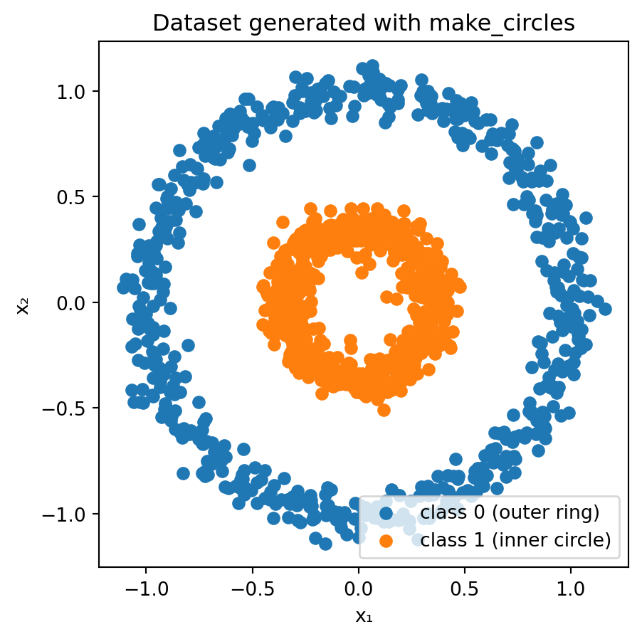
During the lecture, I recommended using TensorFlow Playground as an interactive tool to deepen your intuitive grasp of neural networks and machine learning principles. In particular, I advised experimenting with the dataset comprising an inner circle (class 1) and an outer ring (class 0). This notebook offers a more detailed exploration of these concepts.
# Generate and plot the "circles" datasetimport matplotlib.pyplot as pltfrom sklearn.datasets import make_circles# Generate synthetic dataX, y = make_circles(n_samples=1200, factor=0.35, noise=0.06, random_state=42)# Separate coordinates for plottingx1, x2 = X[:, 0], X[:, 1]# Plot the two classesplt.figure(figsize=(5, 5))plt.scatter(x1[y==0], x2[y==0], color="C0", label="class 0 (outer ring)")plt.scatter(x1[y==1], x2[y==1], color="C1", label="class 1 (inner circle)")plt.xlabel("x₁")plt.ylabel("x₂")plt.title("Dataset generated with make_circles")plt.axis("equal") # ensures circles look roundplt.legend()plt.show()
Clearly, this dataset is not linearly separable in \((x_1, x_2)\)!
Feature engineering
When using a linear classifier like LogisticRegression, it is not possible to derive parameters that enable accurate classification of the given examples.
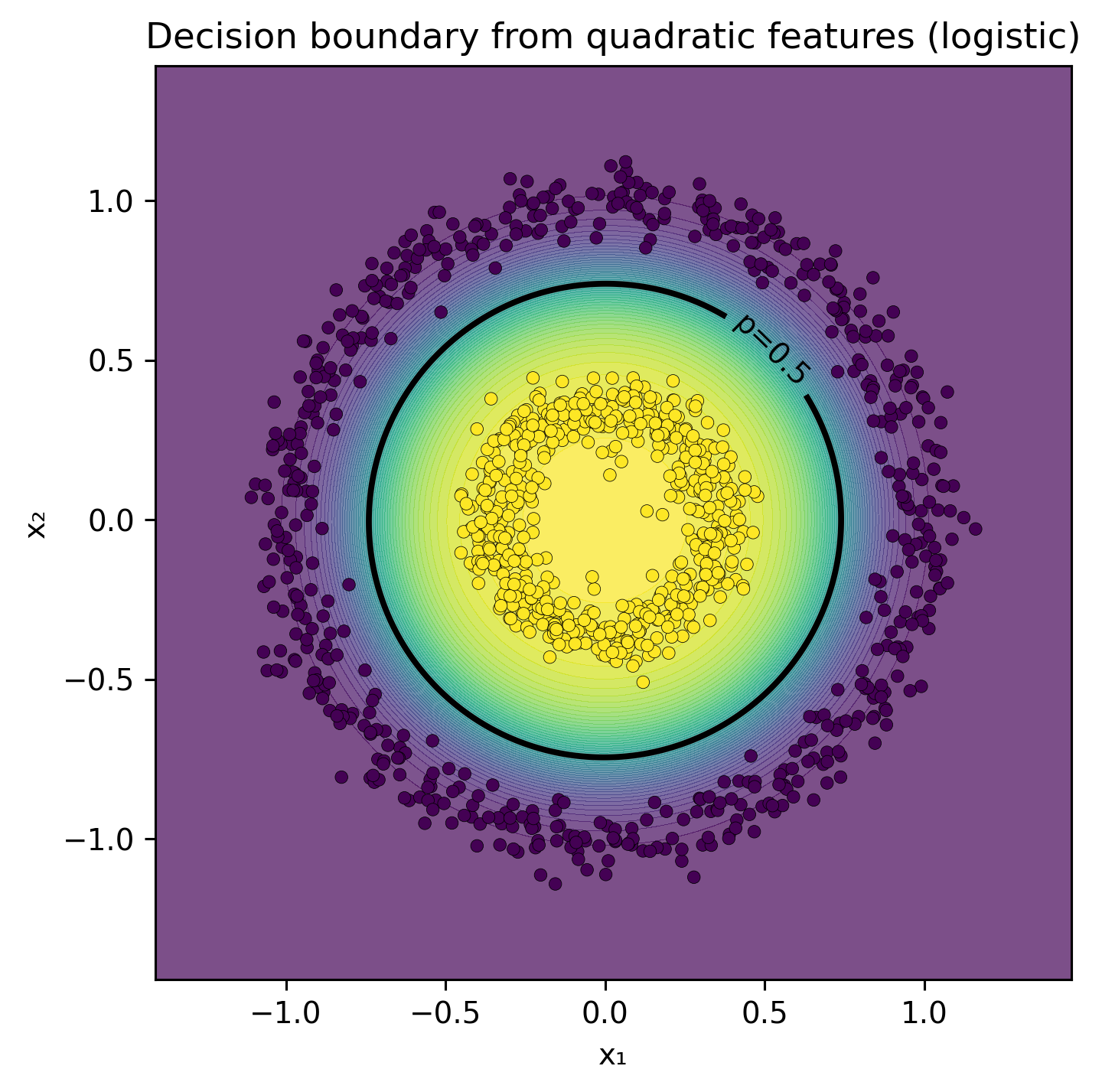
In TensorFlow Playground, users can incorporate two additional features, \(x_1^2\) and \(x_2^2\). This allows for the classification of examples using a straightforward network configuration with no hidden layers and a single output node. When employing the sigmoïd function as the activation, this setup effectively functions as logistic regression. However, the feature space becomes four-dimensional, complicating direct visualization.
In this notebook, we introduce a single feature specifically designed to facilitate visualization. \[
r = x_1^2 + x_2^2,
\](r) represents the squared distance from the origin — essentially the radius squared in polar coordinates.
Intuition
Each point in the original 2-D plane has coordinates \((x_1, x_2)\).
If you express those same coordinates in polar form, you have
\[
x_1 = r^{1/2} \cos\theta, \quad x_2 = r^{1/2} \sin\theta,
\] or more conventionally, \(r_{\text{polar}} = \sqrt{x_1^2 + x_2^2}\).
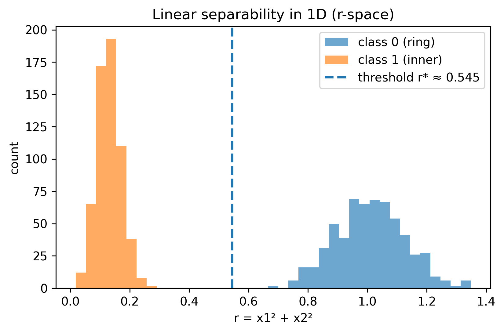
Here, we define \(r = x_1^2 + x_2^2\), i.e., the square of that radius.
Using \(r\) instead of \(\sqrt{r}\) keeps the mapping differentiable and avoids square roots in the model.
Why it’s useful
In the “circle vs. ring” dataset:
Points from the inner circle are close to the origin, small \(r\).
Points from the outer ring are farther away, large \(r\).
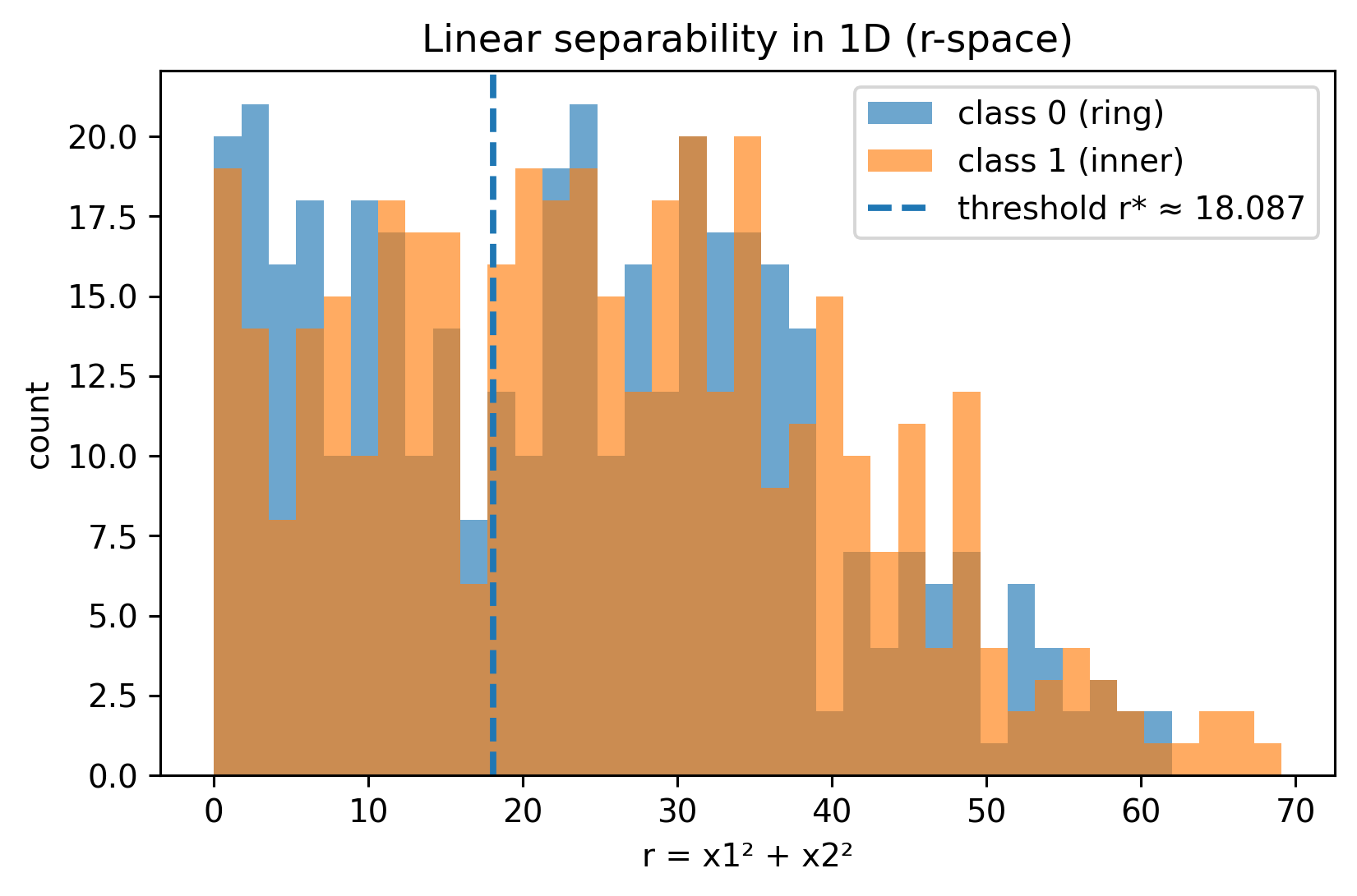
Thus, the problem that is non-linear in \((x_1, x_2)\) becomes linearly separable in \(r\):
\[
\text{inner if } r < r^*, \quad \text{outer if } r > r^*.
\]
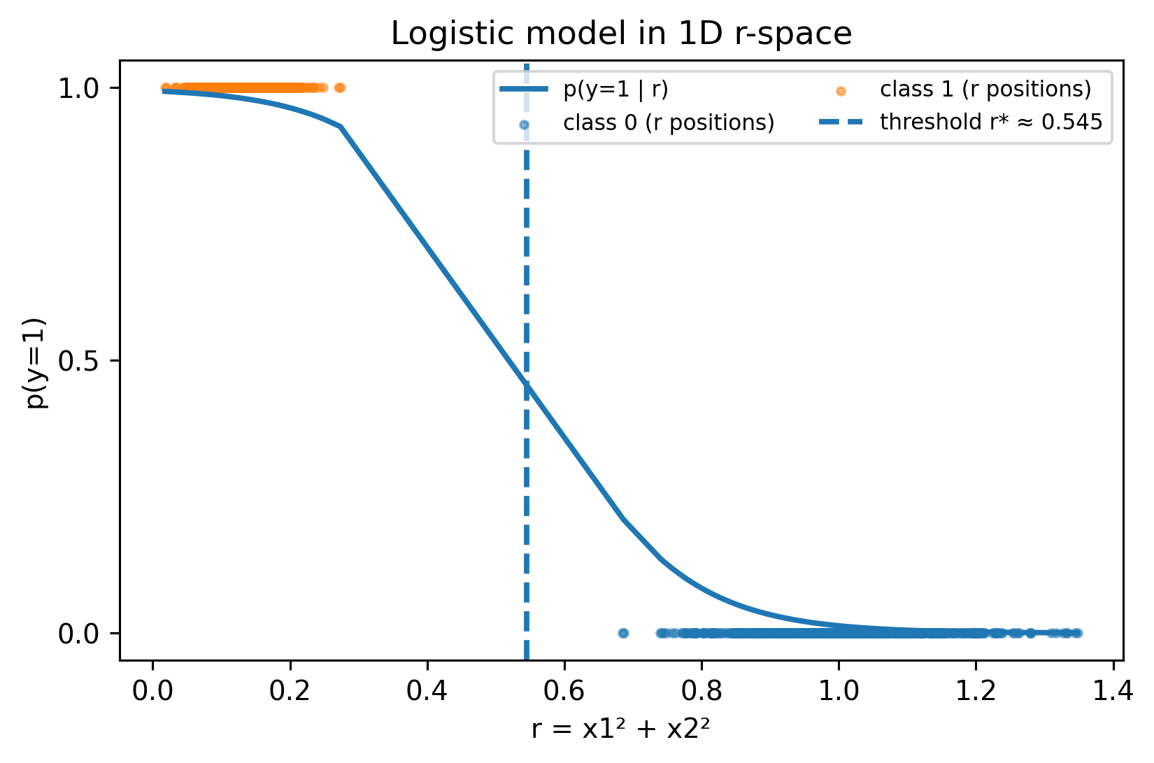
So \(r\) is a feature encoding the radial distance, allowing a linear model like logistic regression to separate the classes with a single threshold in 1-D.
3D view
\((x_1,x_2,r)\) with \(r=x_1^2+x_2^2\)
import numpy as npfrom sklearn.datasets import make_circlesfrom sklearn.linear_model import LogisticRegressionimport plotly.graph_objects as go# --- our new feature ---r = x1**2+ x2**2# --- fit logistic on r only and get threshold plane ---clf = LogisticRegression().fit(r.reshape(-1,1), y)w =float(clf.coef_[0][0]); b =float(clf.intercept_[0])r_thresh =-b / w# --- 3D scatter of (x1, x2, r) ---scatter = go.Scatter3d( x=x1, y=x2, z=r, mode="markers", marker=dict(size=3, color=y, colorscale="Viridis", showscale=False), hovertemplate="x1=%{x:.3f}<br>x2=%{y:.3f}<br>r=%{z:.3f}<extra></extra>", name="points")# --- horizontal plane z = r_thresh ---gx = np.linspace(x1.min()-0.2, x1.max()+0.2, 50)gy = np.linspace(x2.min()-0.2, x2.max()+0.2, 50)GX, GY = np.meshgrid(gx, gy)GZ = np.full_like(GX, r_thresh)plane = go.Surface( x=GX, y=GY, z=GZ, opacity=0.35, showscale=False, hoverinfo="skip", name="p=0.5 plane")fig = go.Figure(data=[plane, scatter])fig.update_scenes( xaxis_title="x₁", yaxis_title="x₂", zaxis_title="r = x₁² + x₂²", aspectmode="cube", camera=dict(eye=dict(x=1.6, y=1.6, z=0.9)))fig.update_layout(margin=dict(l=0,r=0,b=0,t=20), title=f"Decision plane at r* ≈ {r_thresh:.3f}")fig## Unfotunately, plotly graphical objects can only be visualized in HTML, not PDF.## TODO: Explore https://plotly.com/python/static-image-export/, perhaps this is a workaround.
Linear separability in 1D (r-space)
Comparing two models, clf_r uses a single attribute, \(r=x_1^2+x_2^2\), whereas quad includes degree 2 polynomial features.
from sklearn.pipeline import Pipelinefrom sklearn.preprocessing import PolynomialFeaturesr = (x1**2+ x2**2).reshape(-1, 1)# Modelsclf_r = LogisticRegression().fit(r, y)quad = Pipeline([ ("poly", PolynomialFeatures(degree=2, include_bias=False)), ("logreg", LogisticRegression(max_iter=1000))]).fit(X, y)# Threshold r* (p=0.5) for the r-only modelw =float(clf_r.coef_[0][0]); b =float(clf_r.intercept_[0])r_thresh =-b / w ifabs(w) >1e-12elseNone
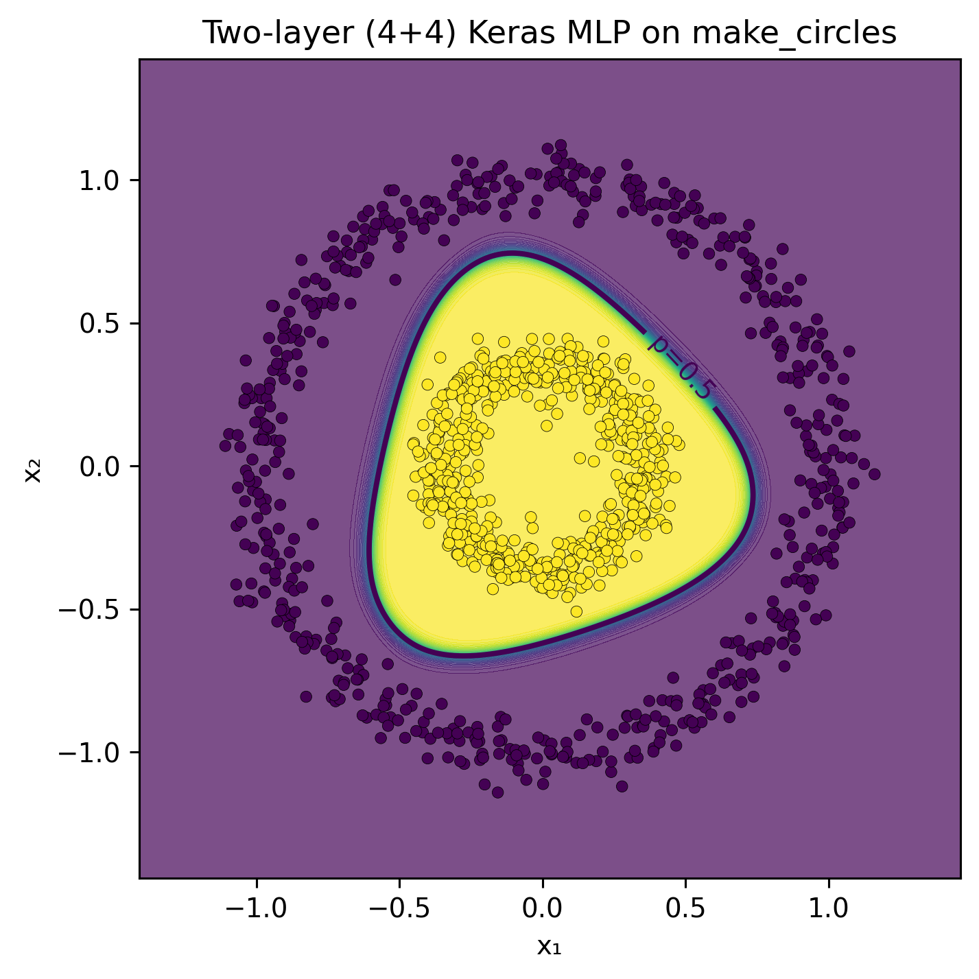
To further our understanding of neural networks behavior, let’s configure a model to use only the features \(x_1\) and \(x_2\). We will set up two hidden layers, each consisting of four neurons. In my experiments, the Tanh activation function led to rapid network convergence. The Sigmoid function also converged, though at a slower pace. Meanwhile, the ReLU activation function enabled quick convergence but produced a decision boundary comprised of linear segments.
from sklearn.model_selection import train_test_split# Two-layer (4 + 4) Keras MLP on make_circles + decision boundary plotimport tensorflow as tffrom tensorflow import kerasfrom tensorflow.keras import layers# 0) Reproducibilitynp.random.seed(42)tf.random.set_seed(42)# 1) DataX_train, X_valid, y_train, y_valid = train_test_split( X, y, test_size=0.25, random_state=42, stratify=y)
# 2) Model: 2 hidden layers with 4 units each# tanh works nicely here due to circular symmetry (ReLU is fine too).model = keras.Sequential([ layers.Input(shape=(2,)), layers.Dense(4, activation="tanh"), layers.Dense(4, activation="tanh"), layers.Dense(1, activation="sigmoid")])
# 3) Plot helper: decision boundary in the original (x1, x2) planedef plot_decision_boundary(model, X, y, title="Keras MLP decision boundary"):# grid over the input plane pad =0.3 x1_min, x1_max = X[:,0].min()-pad, X[:,0].max()+pad x2_min, x2_max = X[:,1].min()-pad, X[:,1].max()+pad xx, yy = np.meshgrid( np.linspace(x1_min, x1_max, 400), np.linspace(x2_min, x2_max, 400) ) grid = np.c_[xx.ravel(), yy.ravel()]# predict probabilities on the grid p = model.predict(grid, verbose=0).reshape(xx.shape)# filled probabilities + p=0.5 contour + data points plt.figure(figsize=(5.2, 5.2), dpi=140) plt.contourf(xx, yy, p, levels=50, alpha=0.7) cs = plt.contour(xx, yy, p, levels=[0.5], linewidths=2) plt.scatter(X[:,0], X[:,1], c=y, s=18, edgecolor="k", linewidth=0.2) plt.clabel(cs, fmt={0.5: "p=0.5"}) plt.title(title) plt.xlabel("x₁") plt.ylabel("x₂") plt.tight_layout() plt.show()plot_decision_boundary(model, X, y, title="Two-layer (4+4) Keras MLP on make_circles")
XOR dataset
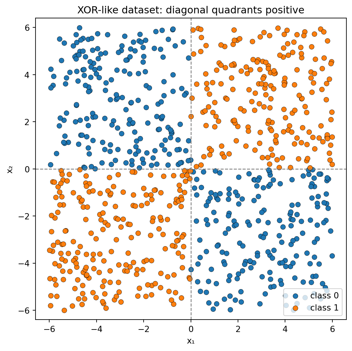
This example uses a classical dataset, characterized by an “exclusive-or” (XOR) pattern, which is frequently employed to demonstrate non-linear decision boundaries and to underscore the necessity of neural networks in addressing such complexities.
# 1. Generate the XOR datasetn_samples =800rng = np.random.default_rng(42)# Features uniformly sampled in [-6, 6]X = rng.uniform(-6, 6, size=(n_samples, 2))x1, x2 = X[:, 0], X[:, 1]# Labels: positive if (x1 and x2) have the same sign (top-left or bottom-right)y = ((x1 * x2) >0).astype(int)# 2. Visualize the dataplt.figure(figsize=(6, 6))plt.scatter(X[y ==0, 0], X[y ==0, 1], color="C0", label="class 0", edgecolor="k", linewidth=0.3)plt.scatter(X[y ==1, 0], X[y ==1, 1], color="C1", label="class 1", edgecolor="k", linewidth=0.3)# Draw axes for clarityplt.axhline(0, color="gray", linestyle="--", linewidth=1)plt.axvline(0, color="gray", linestyle="--", linewidth=1)plt.xlabel("x₁")plt.ylabel("x₂")plt.title("XOR-like dataset: diagonal quadrants positive")plt.xlim(-6, 6)plt.ylim(-6, 6)plt.axis("equal")plt.legend()plt.tight_layout()plt.show()
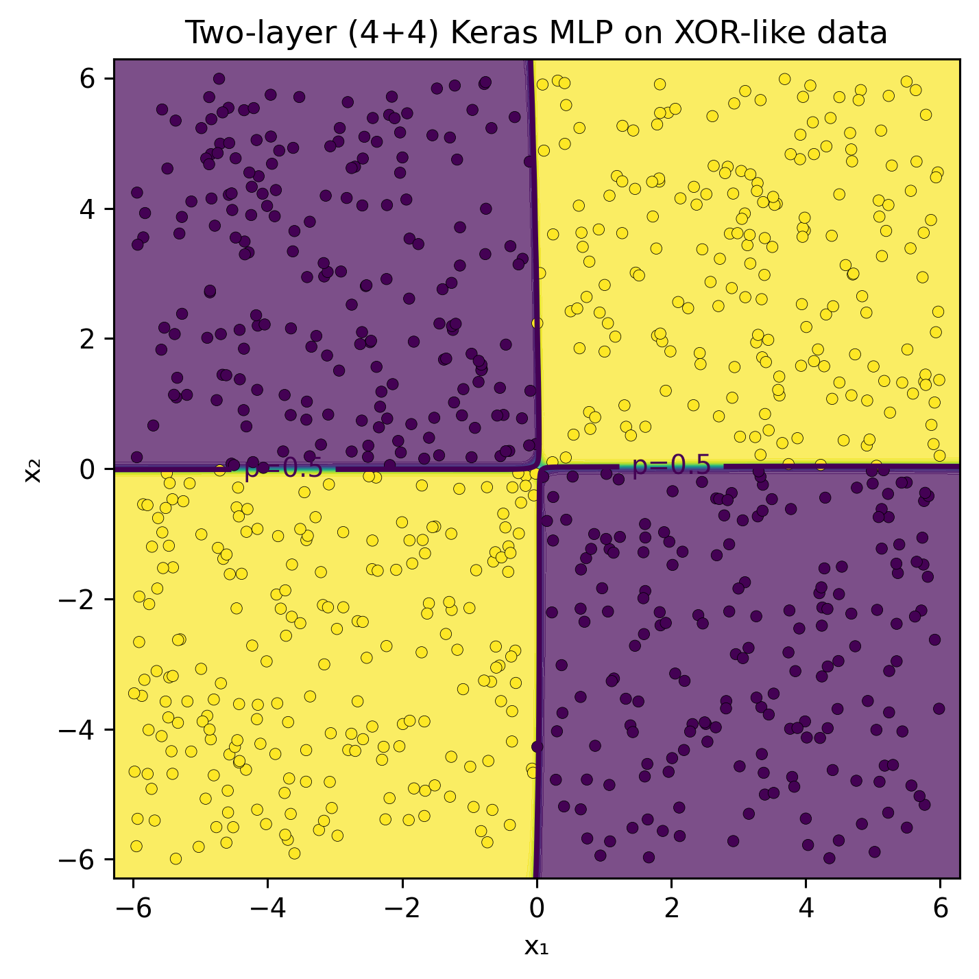
Would it be reasonable to anticipate that the features engineered for circular data could be beneficial in this context?
r = (x1**2+ x2**2).reshape(-1, 1)# Modelsclf_r = LogisticRegression().fit(r, y)quad = Pipeline([ ("poly", PolynomialFeatures(degree=2, include_bias=False)), ("logreg", LogisticRegression(max_iter=1000))]).fit(X, y)# Threshold r* (p=0.5) for the r-only modelw =float(clf_r.coef_[0][0]); b =float(clf_r.intercept_[0])r_thresh =-b / w ifabs(w) >1e-12elseNone
# 2) Model: 2 hidden layers with 4 units each# tanh works nicely here due to circular symmetry (ReLU is fine too).model = keras.Sequential([ layers.Input(shape=(2,)), layers.Dense(4, activation="tanh"), layers.Dense(4, activation="tanh"), layers.Dense(1, activation="sigmoid")])
# 3) Plot helper: decision boundary in the original (x1, x2) planedef plot_decision_boundary(model, X, y, title="Keras MLP decision boundary"):# grid over the input plane pad =0.3 x1_min, x1_max = X[:,0].min()-pad, X[:,0].max()+pad x2_min, x2_max = X[:,1].min()-pad, X[:,1].max()+pad xx, yy = np.meshgrid( np.linspace(x1_min, x1_max, 400), np.linspace(x2_min, x2_max, 400) ) grid = np.c_[xx.ravel(), yy.ravel()]# predict probabilities on the grid p = model.predict(grid, verbose=0).reshape(xx.shape)# filled probabilities + p=0.5 contour + data points plt.figure(figsize=(5.2, 5.2), dpi=140) plt.contourf(xx, yy, p, levels=50, alpha=0.7) cs = plt.contour(xx, yy, p, levels=[0.5], linewidths=2) plt.scatter(X[:,0], X[:,1], c=y, s=18, edgecolor="k", linewidth=0.2) plt.clabel(cs, fmt={0.5: "p=0.5"}) plt.title(title) plt.xlabel("x₁") plt.ylabel("x₂") plt.tight_layout() plt.show()plot_decision_boundary(model, X, y, title="Two-layer (4+4) Keras MLP on XOR-like data")
Pretty impressive, don’t you think?
The key takeaway is that feature engineering combined with basic machine learning models can yield satisfactory results, especially in straightforward scenarios like those illustrated here. When data visualization is feasible or when domain expertise is available, this process is generally accessible. However, in more complex situations involving hundreds or thousands of features and intricate domains, neural networks are particularly effective. Their capability to learn hierarchical representations of features allows them to excel in these challenging contexts.